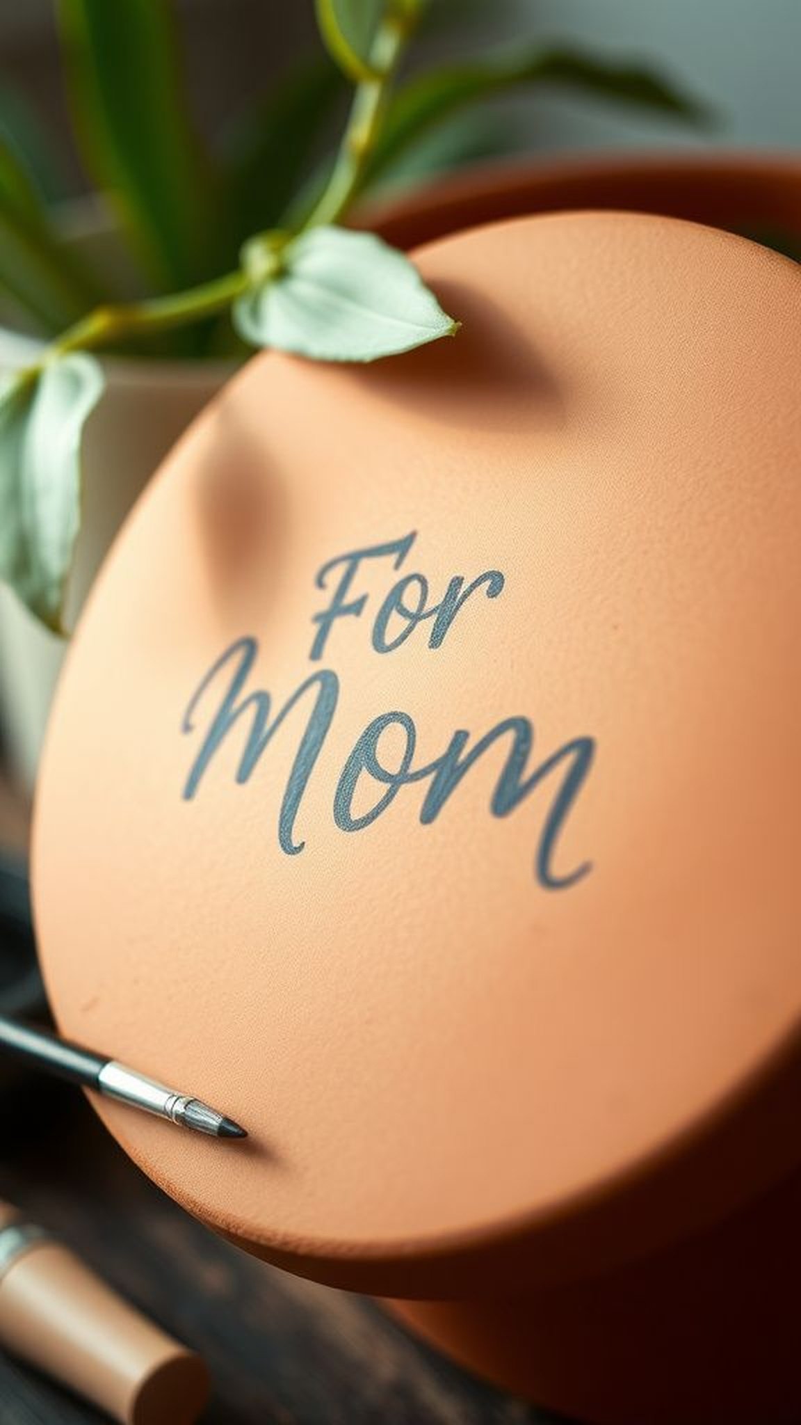
Mother’s Day Flower Pot Painting Crafts can turn ordinary clay into heartfelt gifts that feel personal and homey. Color choices, brushwork, and tiny details bring personality to a simple pot and make a warm little moment for anyone who receives one.
I still remember a late afternoon when a tiny terracotta pot filled the kitchen with bright pigment and laughter.
Making Mother’s Day Flower Pot Painting Crafts felt like a small, joyful ritual that mixed nostalgia and the messy pleasure of bright color on fingertips.
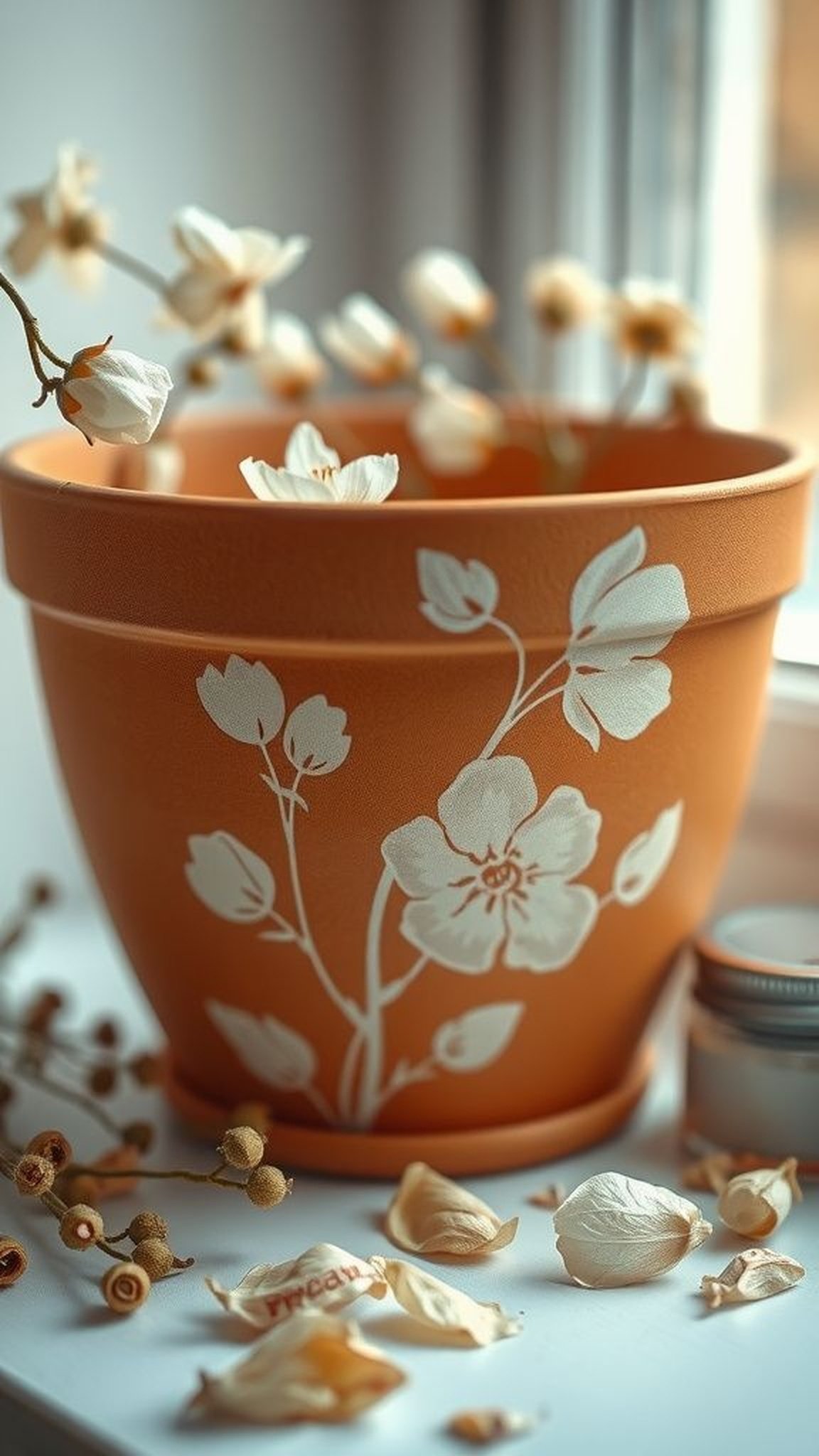
Sunlit daisy pots for a bright windowsill
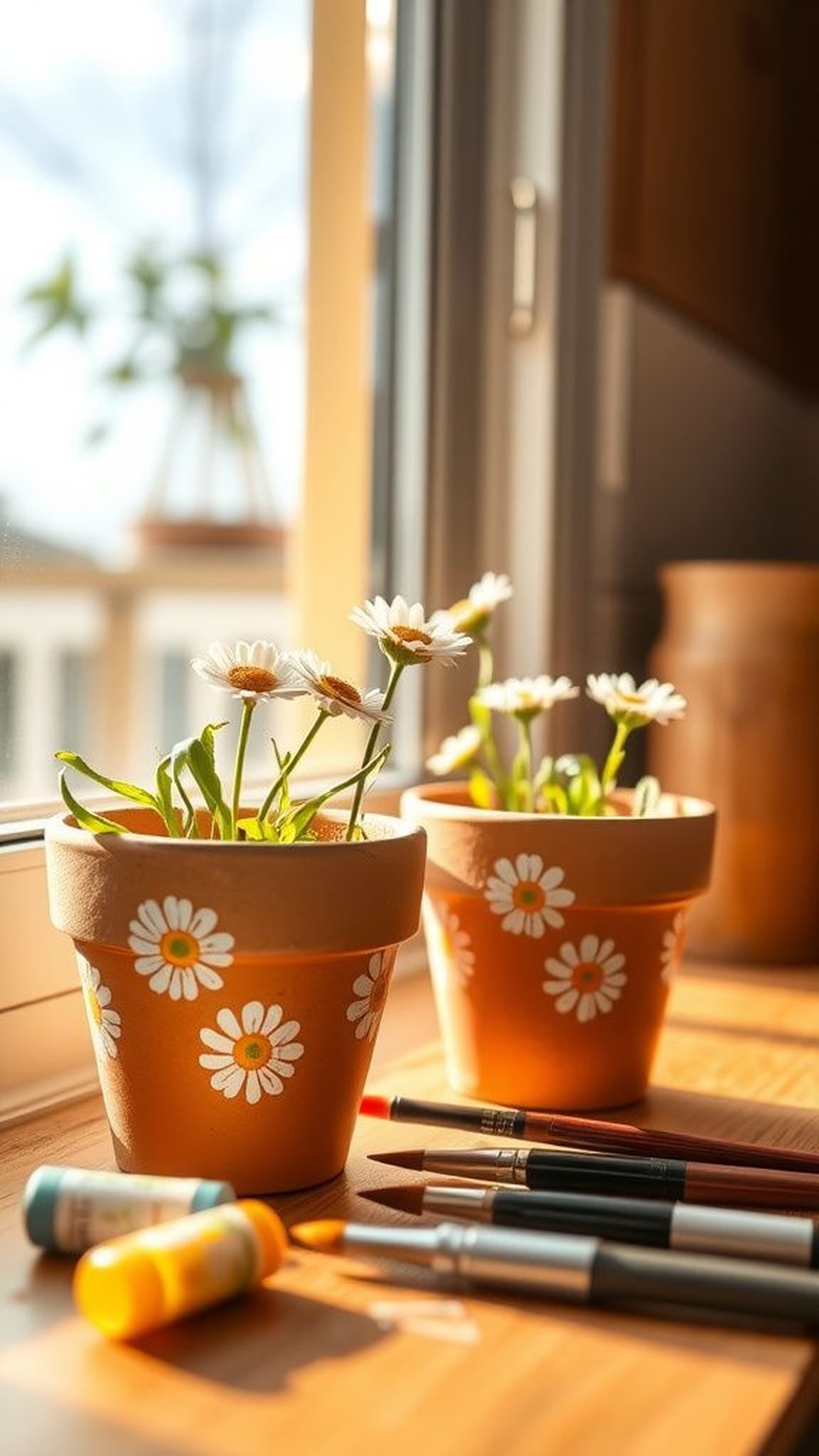
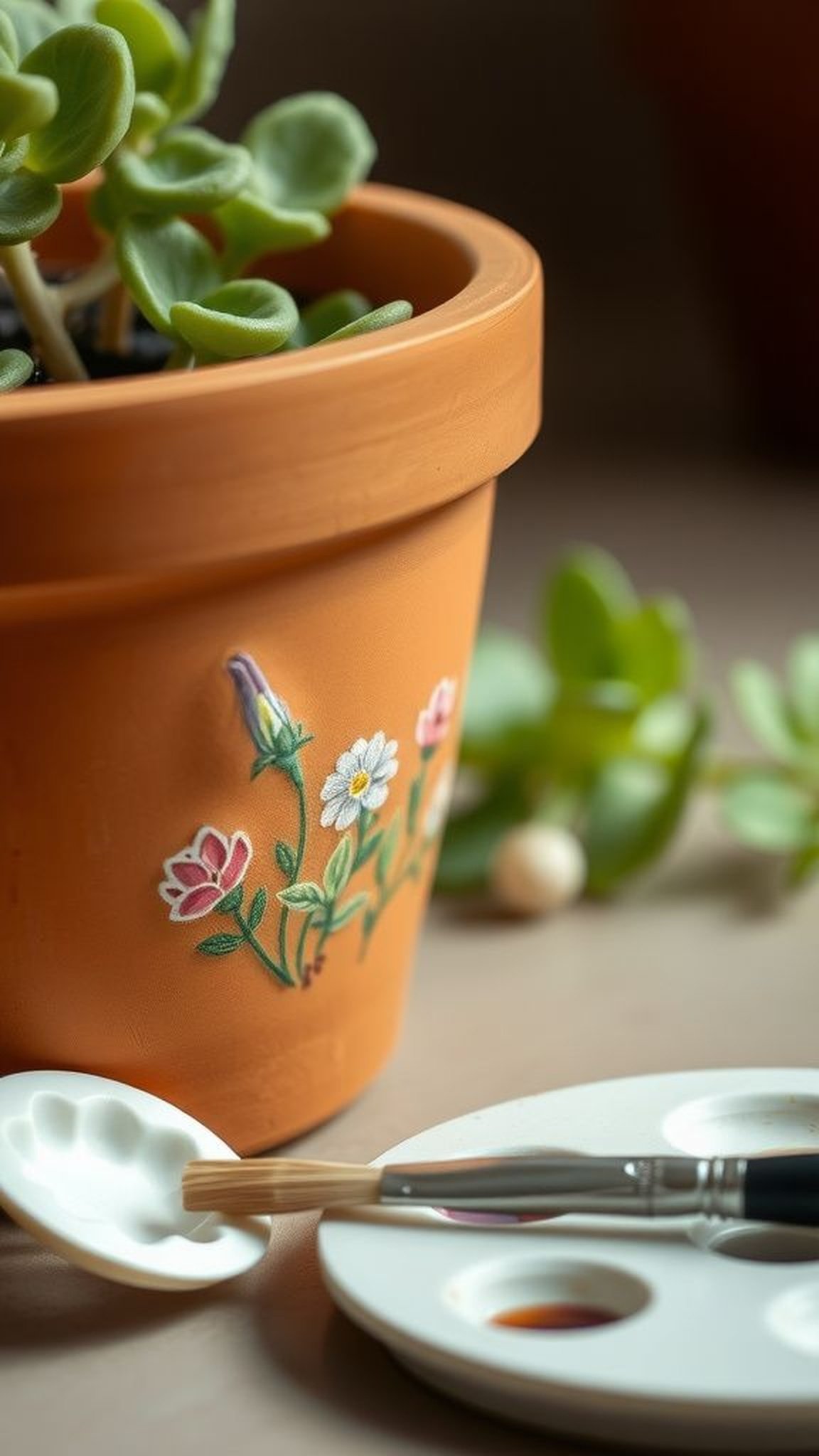
I loved how a pair of small terracotta pots soaked up sunlight and reflected soft yellows across the table. The clay felt slightly gritty against fingertips while bristle strokes left a subtle texture that caught light differently.
Every blossom motif had a looseness that made the pots feel hand-tended rather than perfect. The scent of acrylics lingered faintly and seemed to belong to that afternoon, while the finished gloss made the daisies wink when the sun shifted.
Seeing one on a sill suggested a tiny daily celebration of color.
Steps
- Gather terracotta pots, acrylic colors, a range of brushes, pencil for sketching, and a palette for mixing.
- Lightly clean the pots and sketch simple daisy shapes before brushing on base color, then add petal tones with gentle strokes.
- Layer highlights and shadows with thinner bristles so petals read from a distance; allow each layer to dry.
- Finish with a clear varnish for outdoor resilience and place soil and a small flowering plant inside.
Soft ombré hearts for a sentimental touch
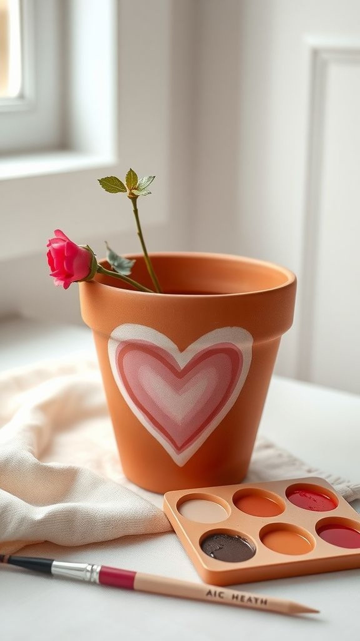
A series of gradient hearts on a clay pot felt tender and calm, like a slow breath captured as color. The transition between one tone and the next had an almost watercolor softness, while the pot’s rim remained pleasantly rough under fingertips.
There was a quiet joy in watching shades blend until they looked like a soft sunset wrapped around the vessel. The gentle sheen on top made the hues glow without appearing too polished, and the overall effect read like a whispered message rather than a proclamation.
Steps
- Select a medium pot and a trio of coordinating acrylic hues to achieve a smooth gradient.
- Block in the darkest tone near the base and the lightest near the rim, blending between with a damp brush.
- Soften transitions with feathered strokes while allowing layers to dry slightly for subtle depth.
- Seal with a clear satin varnish to protect the gradient and add a gentle glow.
Tiny fingerprint florals that feel utterly personal
Pressing tiny fingertip marks into color always created a little laugh and a memory that felt like a keepsake. Each thumb or fingertip left an imperfect dot that assembled into layered floral clusters, and the irregularities became the charm rather than a flaw.
The tactile nature of those small impressions made the pot feel autobiographical, as if a moment in time had been pressed into clay. Fingers smelled faintly of pigment afterward, and the finished clusters read like a day of small, happy interruptions captured forever.
Steps
- Prepare a small pot and a shallow tray of washable acrylics in bright floral shades.
- Dip fingertips lightly into color and stamp them onto the pot in overlapping clusters to build floral shapes.
- Add tiny highlights and centers with a fine-tipped brush to bring depth to the dots.
- Let the surface dry fully and protect with a durable clear coat for longevity.
Rustic chalkboard label pots for heartfelt notes
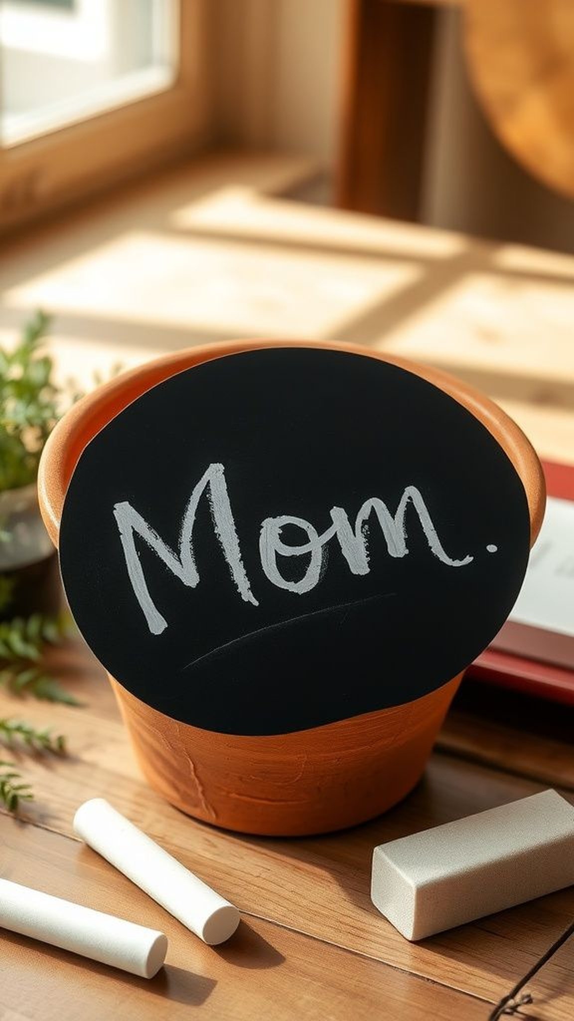
The matte black label strip on clay felt like a little stage for handwritten notes. Chalky strokes made messages feel temporary and playful, and the contrast between the velvety label and the warm terracotta brought a pleasing tactile difference to the palm.
I enjoyed the way a quick scrawl looked casual and intimate, as if someone had left a small, thoughtful whisper. A faint halo of smudged chalk around letters gave that lived-in warmth, and erasing and rewriting became part of the ritual, not a correction.
Steps
- Paint a rectangular matte black label band onto the pot using chalkboard paint and let it dry thoroughly.
- Lightly sand or scuff the label surface for a soft chalk-friendly texture, then season it with a full chalk rub and wipe.
- Write a personal message or plant name with chalk or chalk marker and refresh as desired.
- Protect surrounding areas with a clear matte coating, avoiding the chalk surface.
Delicate pressed flower transfer look without fuss
The illusion of pressed blooms layered onto a pot carried a nostalgic hush, like pages from an old botanical book. Petal silhouettes read softly against a muted background, and the edges of each shape had a translucence that suggested petals had once rested there.
A faint crinkled impression sometimes remained, which felt like evidence of a careful moment rather than perfection. When a pot arrived with that pressed-flower effect, it read as thoughtfully assembled, a small museum of remembered springs that invited gentle handling and close inspection.
Steps
- Choose delicate floral motifs and transfer images or thin pressed petals onto the pot’s surface with a medium transfer medium.
- Smooth the motif and remove any air pockets before the transfer dries for a seamless appearance.
- Once fully dry, gently blend the edges with soft washes of color for a cohesive look.
- Finish with a thin protective top coat that keeps the delicate imagery intact.
Bold botanical silhouettes that read from afar
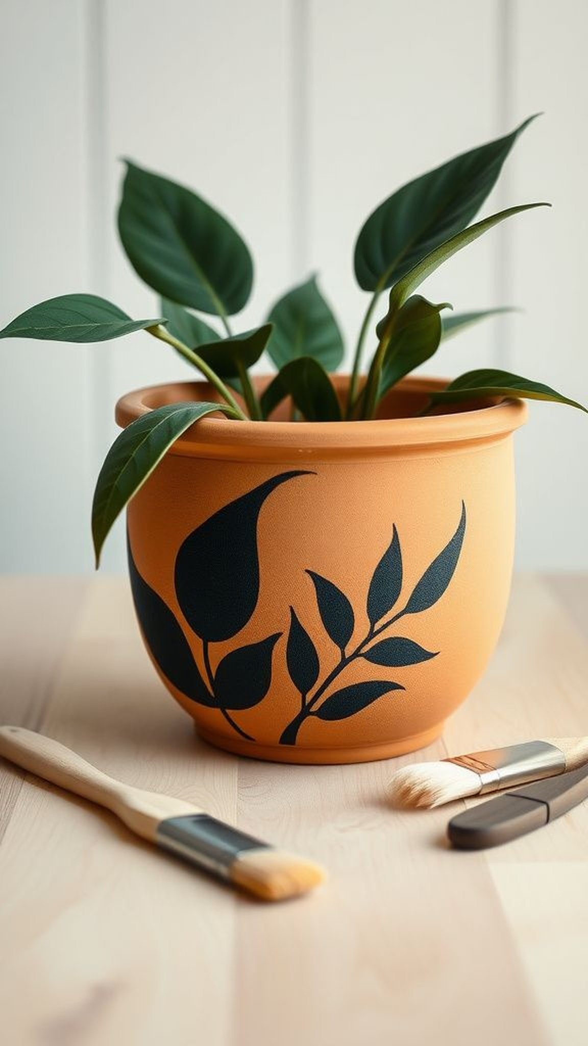
Large, confident leaf and stem silhouettes wrapped around a pot and read like a simple emblem when glanced at across a room. The heavy shapes had an architectural quality against the round clay, and their clean edges contrasted with the pot’s tactile rim.
Standing back revealed a pleasing graphic rhythm, while a closer look rewarded with subtle brushwork and tiny imperfections that anchored the boldness in a human hand. The combination felt lively rather than austere, like something that could belong both in a sunroom and on a cluttered kitchen counter.
Steps
- Sketch major botanical silhouettes lightly in pencil to guide proportion and placement.
- Fill the silhouettes with a solid color using a flat brush and refine the edges with a smaller brush for crispness.
- Add subtle interior shading or vein detail to add dimension to the silhouettes.
- Protect the surface with a clear varnish suitable for indoor or outdoor display.
Playful polka dots that bring a joyful bounce
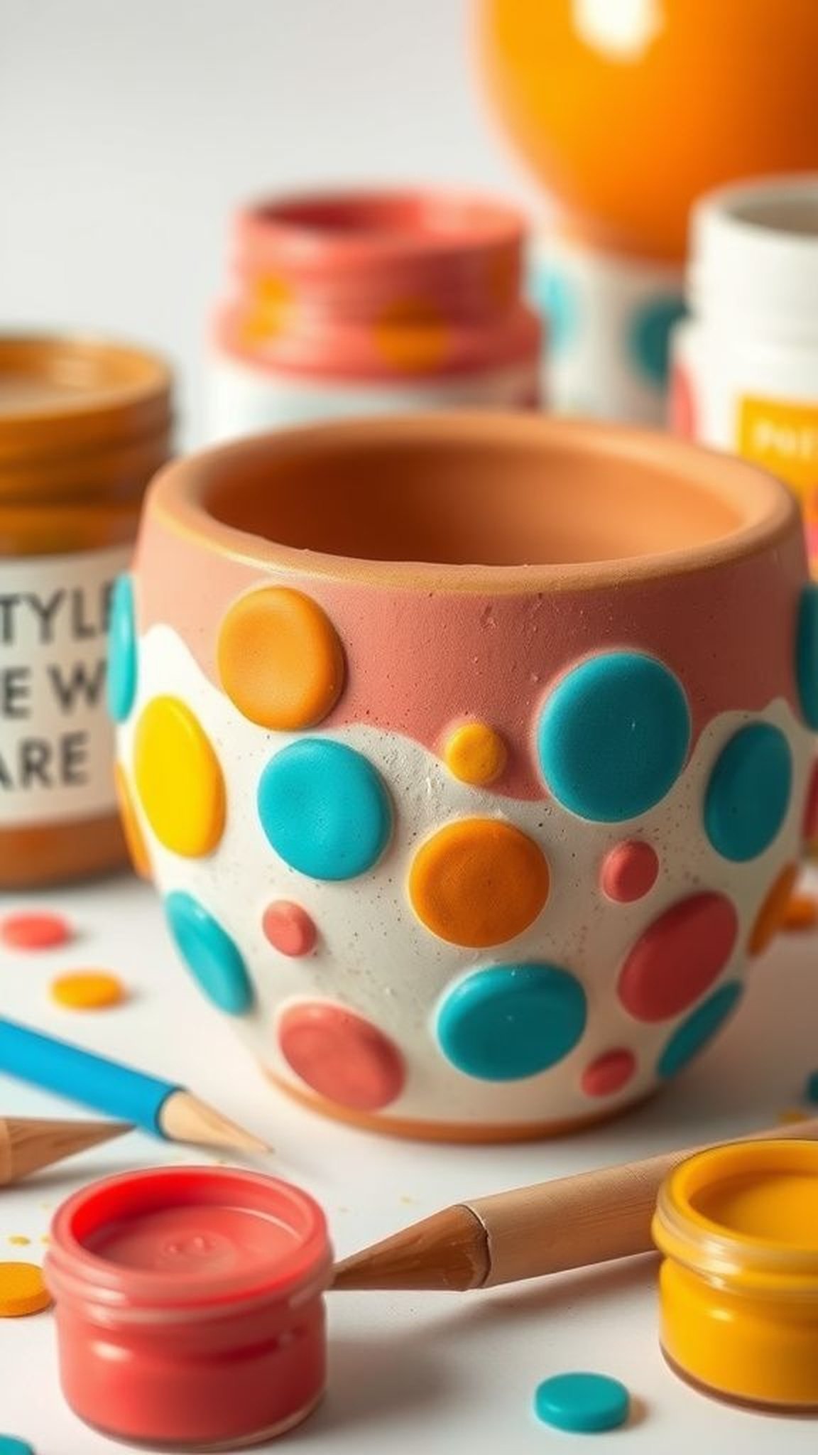
Clusters of hand-dotted circles always felt cheerful, as if the pot had caught a little confetti storm. The round marks varied just enough in size and pressure to keep the eye engaged, and the tiny raised edges of thicker dots provided a delightful tactile surprise under a thumb.
Color combinations of coral, teal, and mustard created a retro palette that made the pot whisper a playful secret. Placing one on a bedside table seemed to brighten the whole corner, and guests often paused to admire the friendly, rhythmic pattern.
Steps
- Choose three or four complementary colors and a selection of round dotting tools or brush ends of varying sizes.
- Plan a loose pattern and dot colors in a balanced but spontaneous arrangement around the pot.
- Build depth by layering lighter dots atop darker bases for subtle dimension.
- Finish with a clear protective coat once the dots are fully dry to preserve texture.
Vintage script and tiny handwritten messages
Scripted words looping across a pot felt intimate and slightly secretive, like a little letter tucked into a plant. The sway of cursive lines and the variance in pressure gave the surface a human heartbeat, while tiny flourishes read like affectionate afterthoughts.
Ink-like strokes contrasted with the clay’s warmth, and the smallness of the lettering invited leaning in for a closer look. Each misshapen curve or wobbly baseline added personality, turning a simple pot into a modest love note meant to be kept on a bedside or kitchen shelf.
Steps
- Plan a short phrase or name and practice the script on paper to find an appealing flow.
- Transfer faint pencil guidelines onto the pot and trace the lettering with a fine-tipped brush or paint marker in a dark tone.
- Add tiny decorative flourishes or a contrasting highlight along one edge of letters for depth.
- Protect the finished script with a clear satin varnish to prevent fading.
Metallic accents that catch late afternoon light
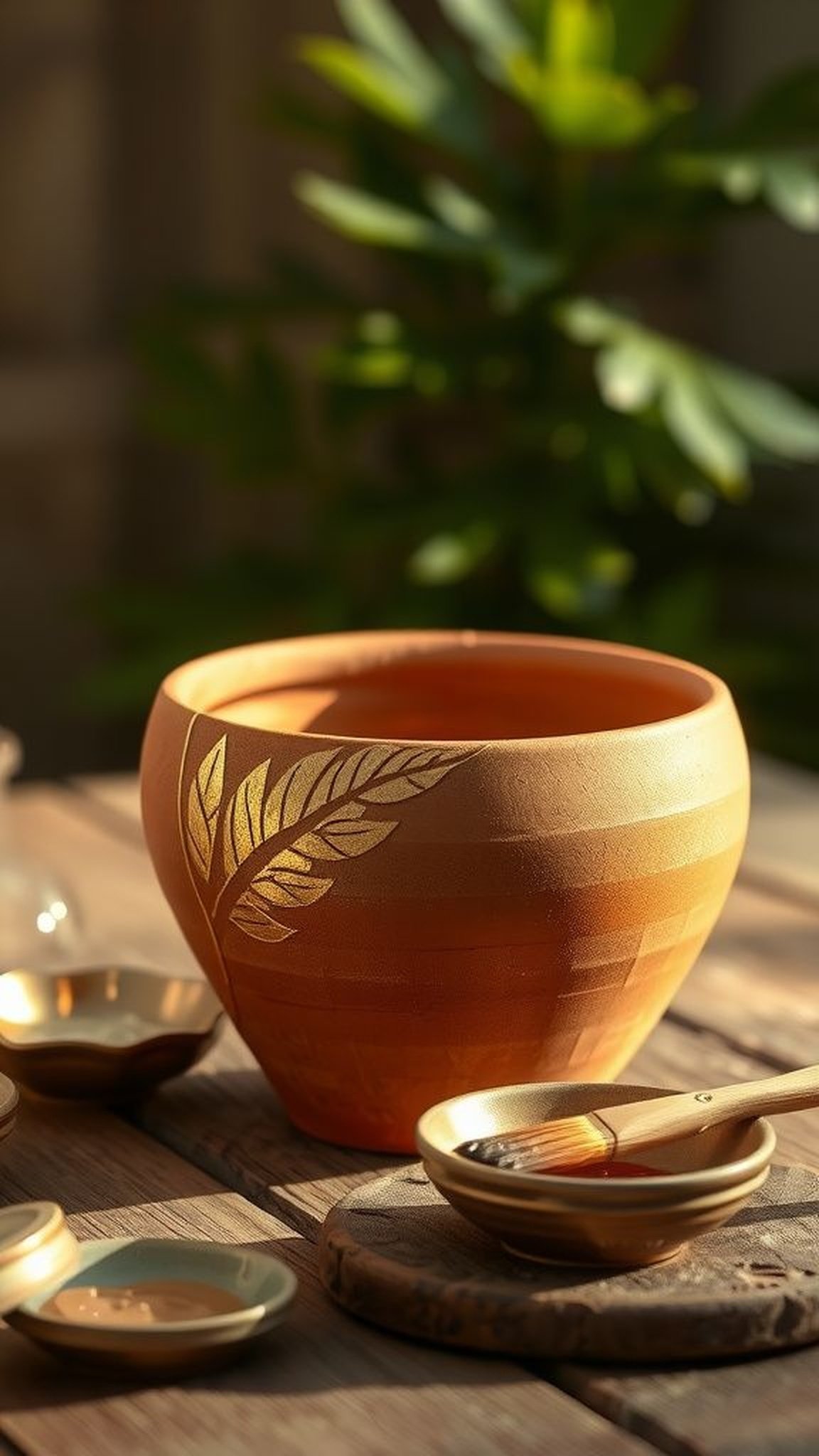
A whisper of metallic along the rim and in tiny leaf veins made a pot feel dressed for company. The cool glimmer contrasted with the earthen matte, and when the light hit just so, the accents seemed to shift between subtle and celebratory.
There was a pleasant tactile difference where metallic lay a touch thicker, and the shimmer made floral motifs sing without overpowering them. Bringing a pot with these small gleams into an entryway felt like offering a modest sparkle that invited people to pause and smile.
Steps
- Choose one or two metallic tones such as gold or copper to complement the base colors of the pot.
- Highlight rims, leaf veins, or tiny accents with a small fine brush for controlled shimmer.
- Allow the metallic layers to cure fully before handling to avoid smudges.
- Seal gently with a clear topcoat to preserve the metallic sheen while protecting the surface.
Mosaic-inspired shards for a handcrafted flair
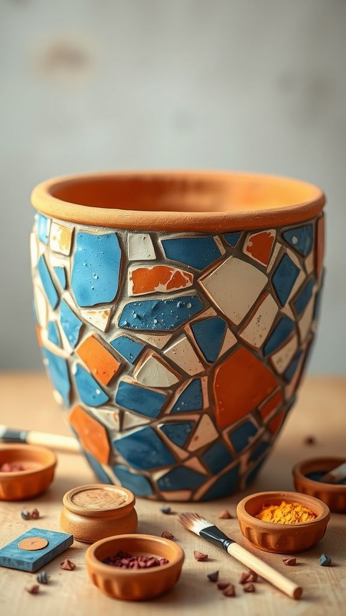
Tiny painted shard motifs emulated tiled mosaics in a way that felt playful and homey. The irregular shapes and contrasting grout-like lines added a handcrafted rhythm to the pot’s curve, and up close the faux-tile edges showed the gentle imperfections of a human hand.
Color shifts between shards created a lively cadence, while the overall pattern read as deliberate yet relaxed. That juxtaposition of order and looseness made the pot feel like a little artifact, carrying the glow of spent afternoons and focused attention.
Steps
- Sketch a loose mosaic layout across the pot, planning larger and smaller shard shapes for balance.
- Fill each shard with distinct color and outline faint grout lines between shapes for separation.
- Vary tones and saturation within shards to mimic natural tile variation.
- Protect the design with a clear varnish that enhances color and durability.
Modern geometric bands for a chic minimalist gift
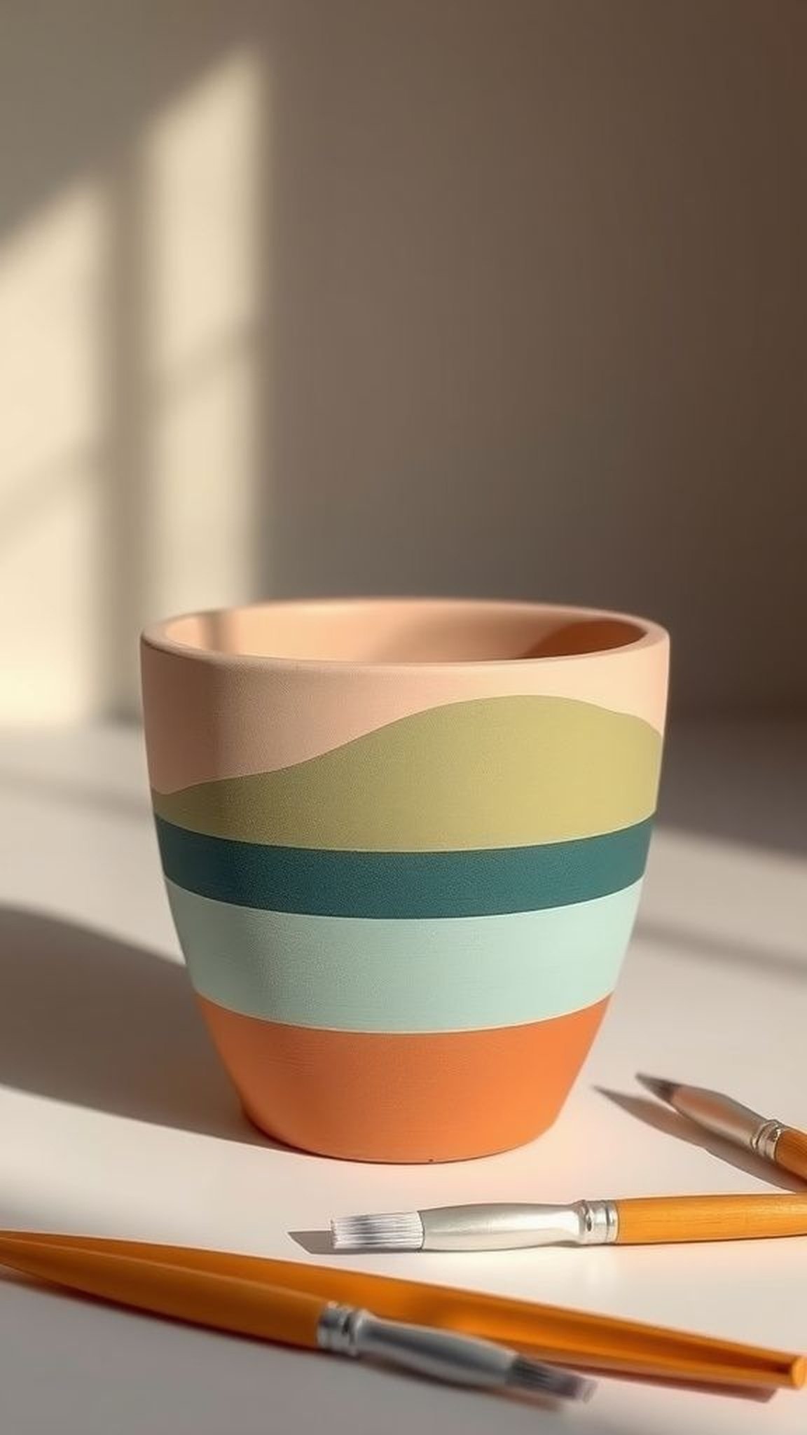
Strips of color in measured bands wrapped the pot like a simple ribbon, offering a calm, modern statement that still felt warm. The crispness of the edges contrasted pleasantly with the pot’s curve, and alternating matte and slightly glossy finishes created a subtle conversation under fingertips.
The palette of muted greens and clay tones read contemporary without feeling cold, and the overall composition suggested quiet consideration. It felt like a grown-up approach to crafting, where restraint and texture combined to make a gentle, sophisticated present.
Steps
- Measure and mark bands lightly with pencil around the pot to achieve even spacing.
- Fill each band with chosen colors using a flat brush, keeping edges clean and consistent.
- Alternate finishes like matte and satin to add subtle tactile contrast.
- Apply a protective clear coat to preserve the bands and enhance durability.
Lavender sprigs stenciled for a Provençal feeling
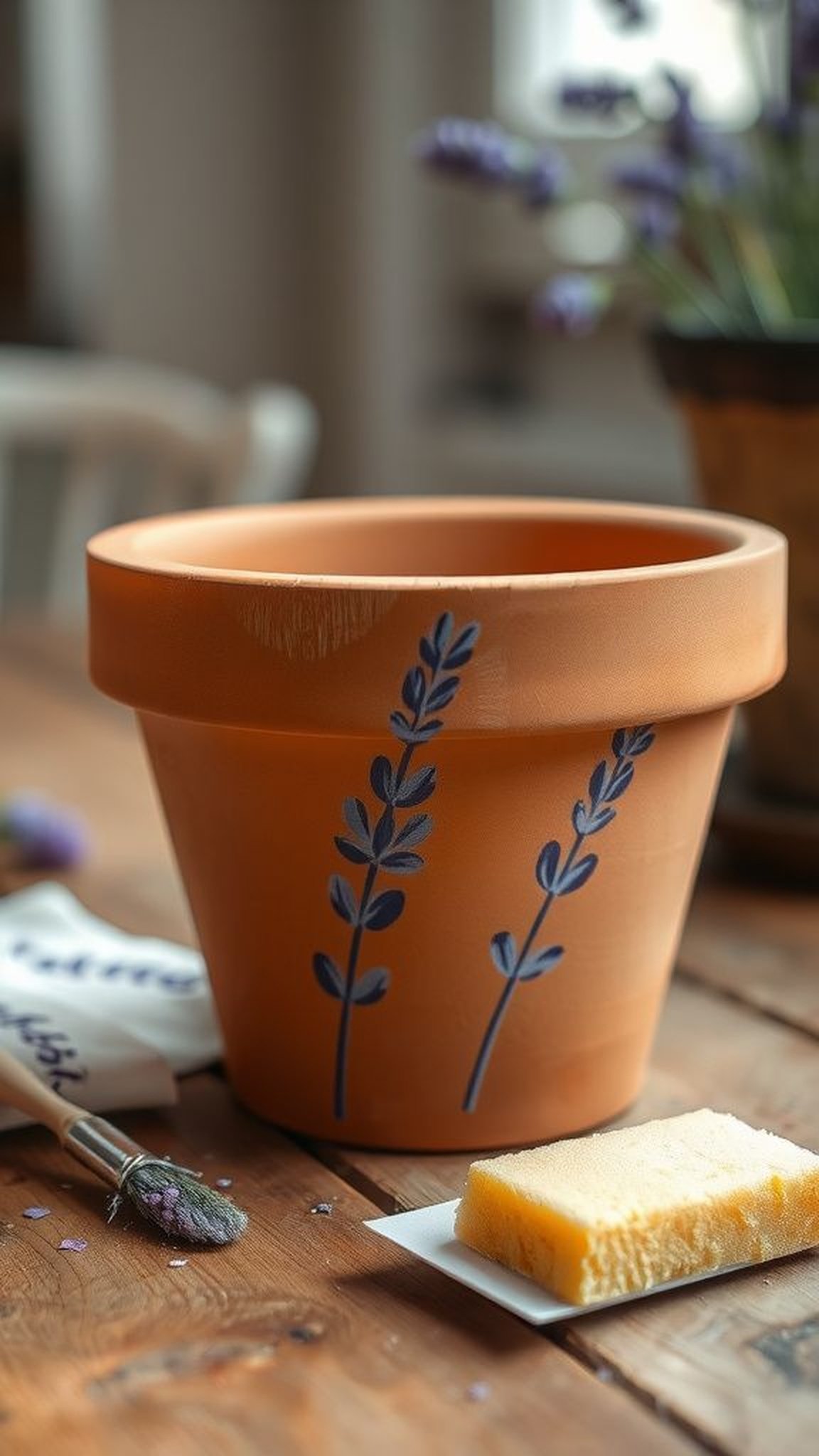
Soft rows of lavender silhouettes brought a breath of the countryside into a small pot, conjuring the aroma and hush of distant fields. The repeated motif created a gentle rhythm around the vessel, and faint unevenness at the edges gave it a hand-blocked charm.
Cooler purples against a warm base made the sprigs feel fresh, and close inspection rewarded with tiny overspray speckles and brush halos that read as honest handiwork. Giving one of these to someone suggested a sent moment of calm and the scent of summers stored in memory.
Steps
- Secure a lavender stencil onto the pot and choose a palette of soft purples and green-gray tones.
- Dab color through the stencil with a stencil brush or sponge for crisp silhouettes.
- Add subtle shading around cluster bases for depth and gentle realism.
- Once dry, protect the surface with a clear topcoat suitable for indoor plants.
Hand-drawn succulents for a tiny garden scene
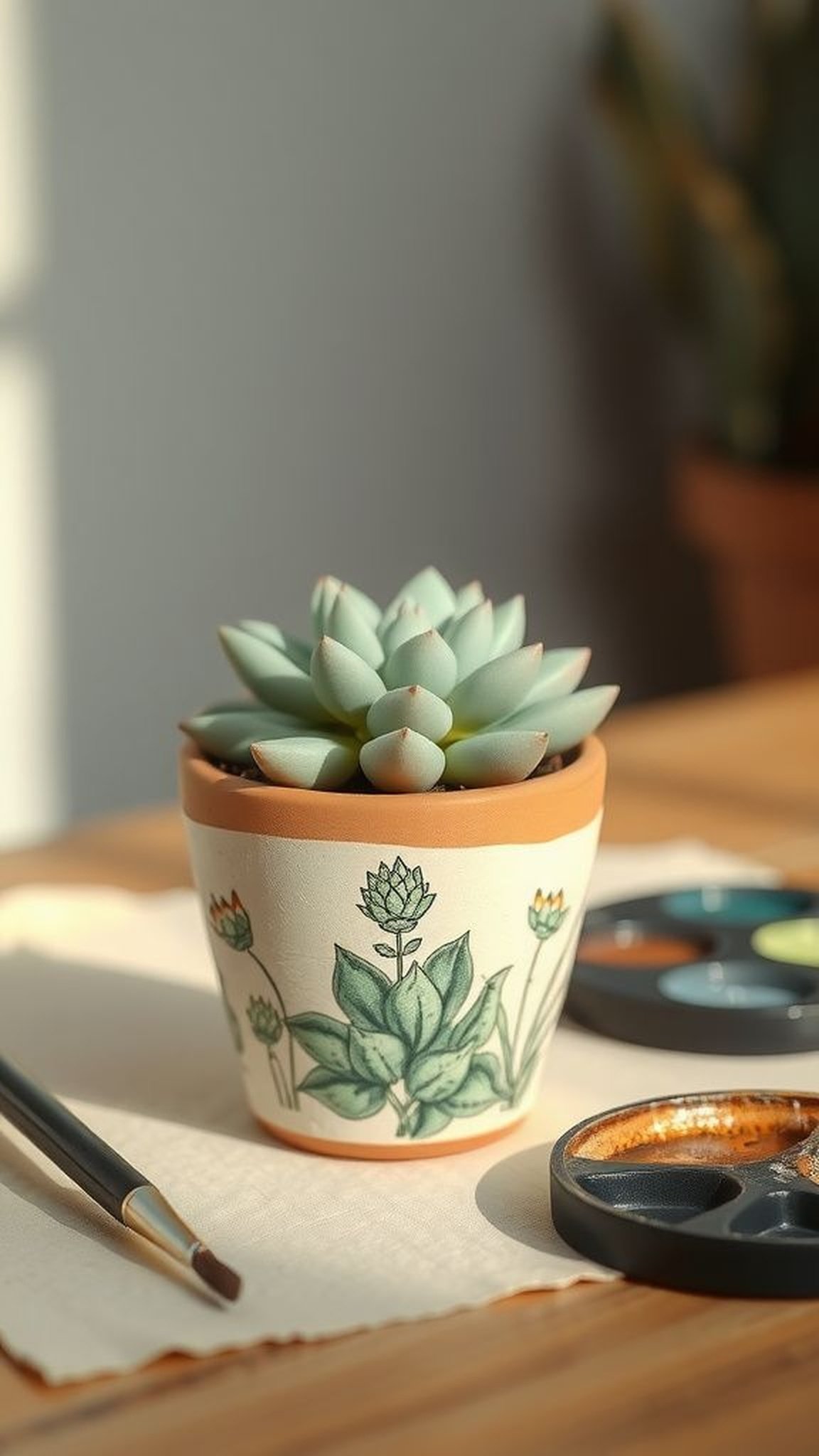
Small succulent sketches looped and layered into a miniature landscape that felt like a peek into a greenhouse. Thin, confident strokes suggested leaf veins and subtle plumpness, and a range of muted greens added a hint of water-retaining life.
The pot read as a little vignette where texture and tiny shadows played against one another. There was a pleasure in seeing a whole assortment of little plant friends gathered on a shelf, each drawn with slight variations that hinted at a slow morning spent imagining a very small world.
Steps
- Sketch succulent shapes lightly with pencil to establish a tiny garden composition.
- Paint base greens with thin washes, building depth with darker tones in leaf bases and creases.
- Refine edges and add fine vein details using a small liner brush for definition.
- Seal with a clear protective coat that preserves delicate line work.
Whimsical animal motifs to evoke a smile
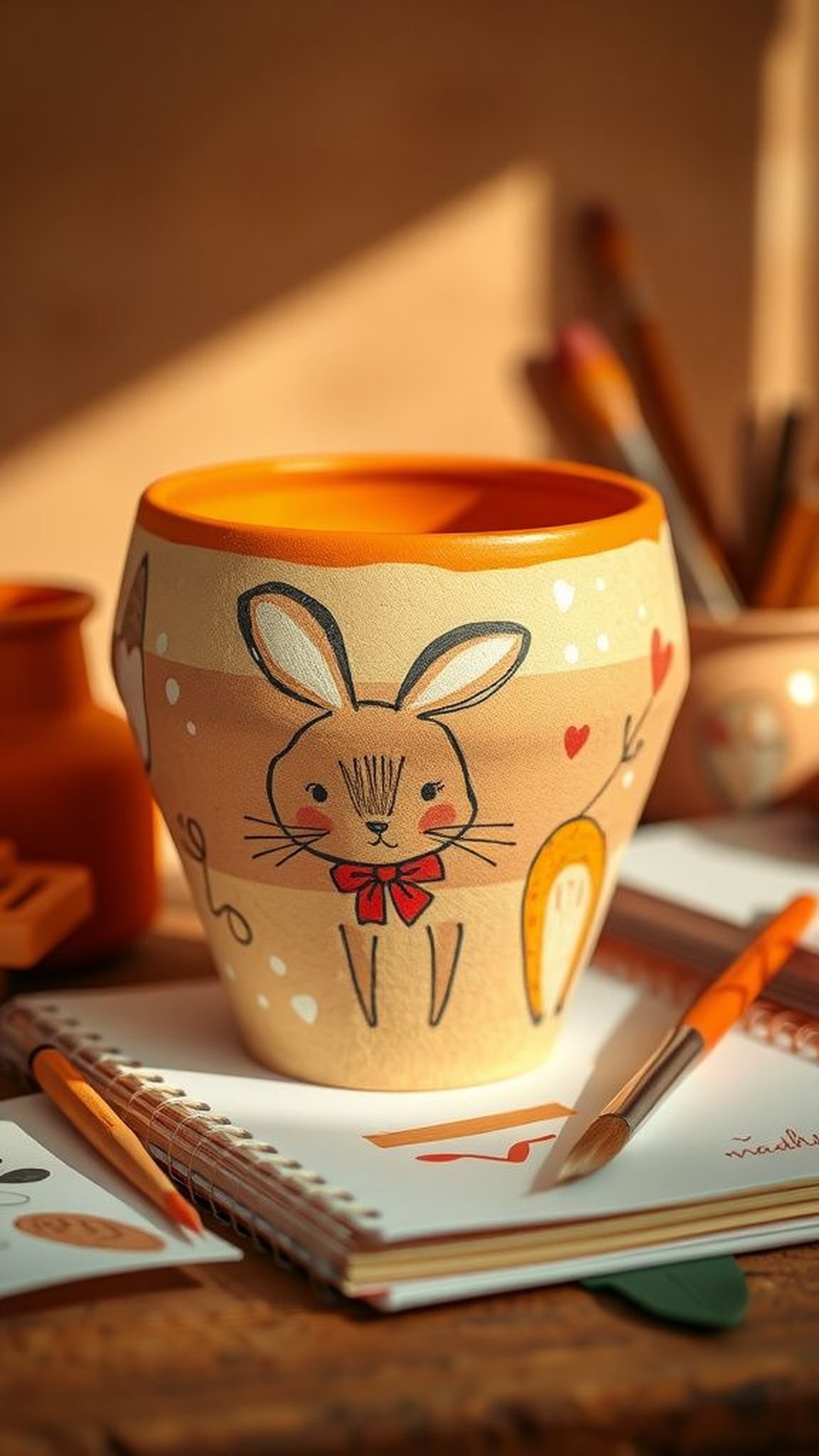
A tiny rabbit, a sleepy fox, or a sleepy bird rendered in playful strokes added a storybook quality to a pot. The character lines were loose, almost doodled, which made each creature feel like a friend rather than an illustration.
The tactile contrast between delicate line work and the pot’s grain created a charming tension that rewarded close attention. Each animal seemed to carry a small mood—mischievous, calm, or curious—and placing such a pot in a living space invited a small narrative to unfold every time it was glanced at.
Steps
- Choose simple animal silhouettes and sketch them lightly to capture expressive poses.
- Define the characters with a combination of thin lines and flat color fills for personality.
- Add tiny highlights or facial details to enhance expression and charm.
- Protect the design with a clear varnish to maintain the character work.
Sunburst motifs for radiant happy energy
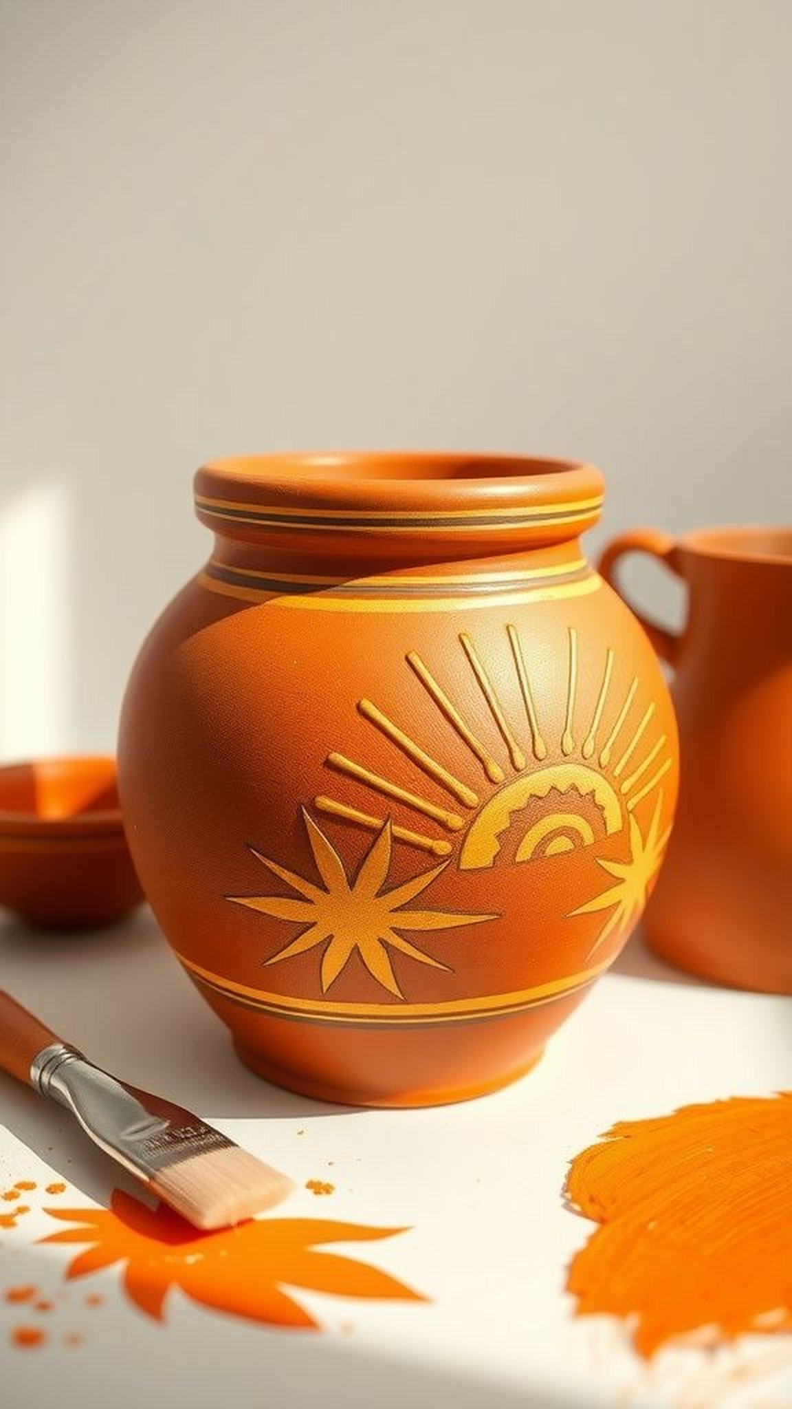
Radiating lines and tiny sun shapes gave a pot an unexpectedly exuberant personality, like it had its own private dawn. The sharp rhythm of rays contrasted with round pot curves and created lively movement as the eye traveled around the vessel.
Warm ochres and pale golds felt sunny without being garish, and the rhythmic repeat had a meditative quality despite its brightness. Placing such a pot in a hallway or near a door felt like offering a small daily benediction of light and warmth to anyone passing by.
Steps
- Lightly mark center points where sunbursts will radiate and choose a warm palette of ochres and golds.
- Paint central sun motifs and extend rays outward with steady, even strokes for rhythm.
- Vary ray lengths and thicknesses to keep the composition lively and organic.
- Finish with a clear topcoat to protect luminous tones from wear.
Subtle speckle finish for an artisanal look
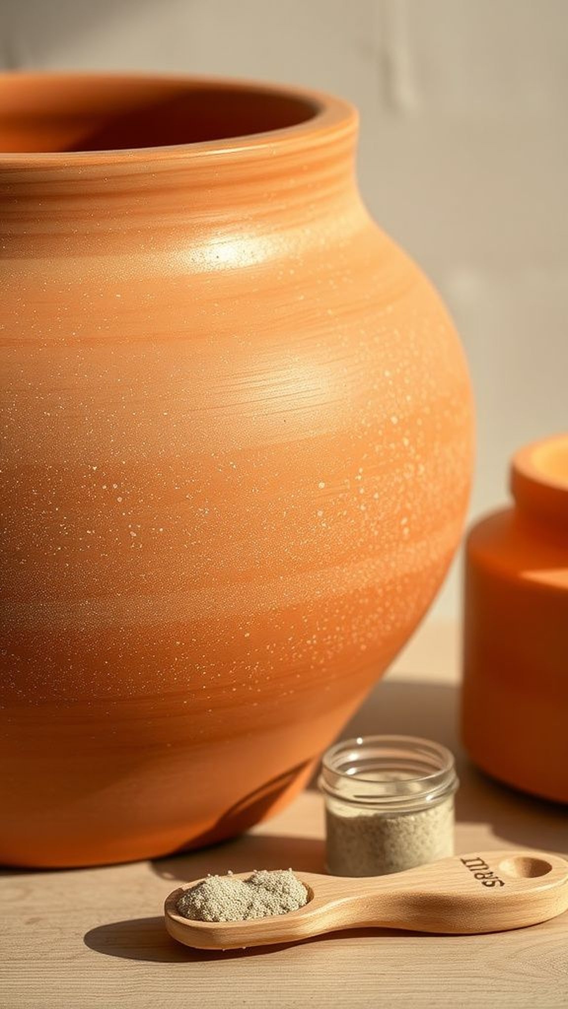
A finely speckled surface read like a pot that had weathered gentle years, yet felt fresh and modern. The tiny flecks added visual interest without demanding attention, and under fingertips the texture felt pleasantly nuanced.
Neutral base tones with darker micro-specks created depth that played nicely against a living green plant. The effect suggested a thoughtful hand and an eye for restraint, turning a modest vessel into something that looked like it had been found in a small coastal studio rather than a big-box aisle.
Steps
- Prepare a neutral base color for the pot and allow it to dry thoroughly.
- Flick contrasting diluted pigment over the surface with a stiff brush or toothbrush to achieve speckling.
- Build up fine layers to reach desired density, allowing drying between passes.
- Protect the finished speckle finish with a clear sealant for longevity.
Map motifs for a journey-themed present
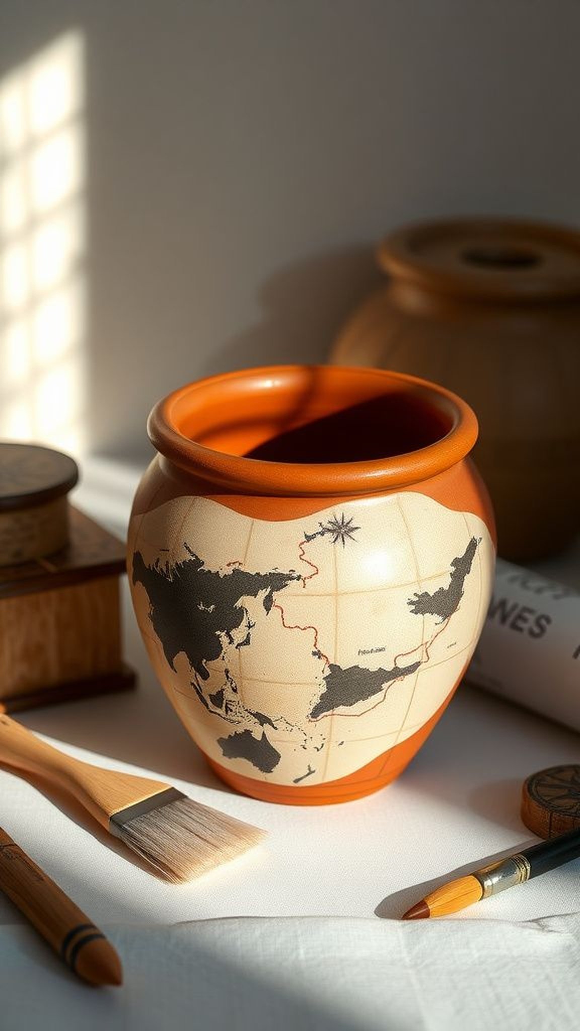
Tiny map-like cartography painted across a pot suggested travel and memory, with winding lines and little icons hinting at favorite places. The tiny compass rose and dotted routes had the playful intimacy of a private map, and the slightly antiqued palette made the pot feel gathered from trips rather than newly made.
Tracing the routes with a fingertip brought a small conversation to life, and seeing someone smile at a familiar landmark painted there made the whole object feel like a shared story in three dimensions.
Steps
- Sketch a loose map layout with paths, tiny landmarks, and a small compass rose to guide composition.
- Define routes with ink-like lines and fill landmark icons with small blocks of color for emphasis.
- Add light antiquing washes or shading to evoke depth and aged charm.
- Apply a clear protective coat to preserve the map imagery.
Whispered pastel washes for a dreamy effect
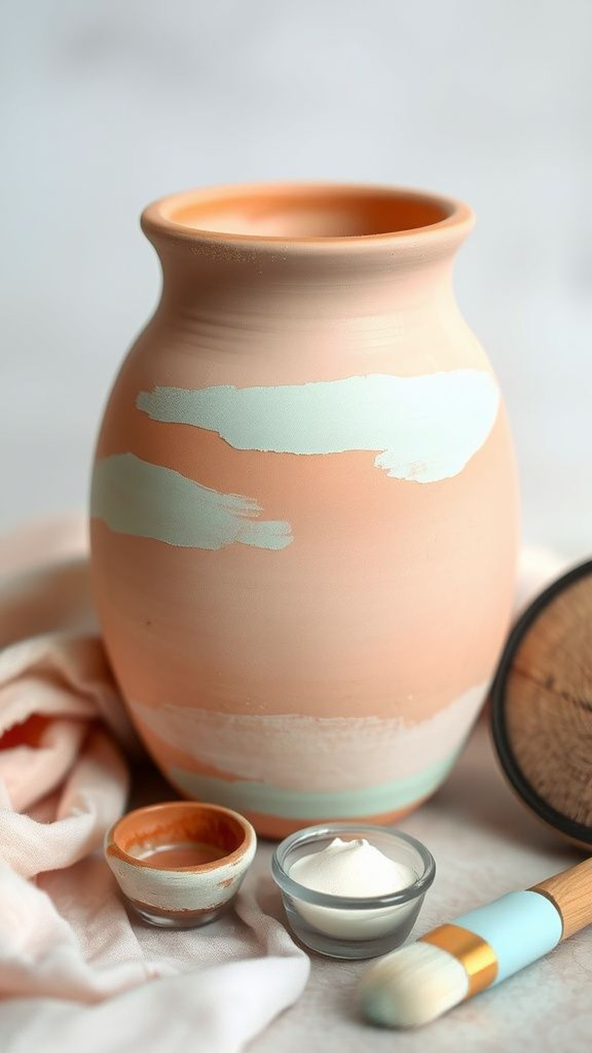
Broad, translucent washes in soft pastels wrapped the pot in a gentle haze, reminiscent of fog-dulled mornings. The layered translucency allowed underlying textures to show through, creating a sense of depth without strong edges.
Bristle marks were soft and feathered, and the overall feeling was quiet and tender. Holding such a pot felt like holding a small cloud—light, calming, and a little bit wistful.
It was the kind of finish that calmed a busy counter, offering a visual exhale amid a day’s clutter.
Steps
- Thin pastel acrylics to a wash consistency and brush them across the pot in overlapping strokes for subtle translucency.
- Build up soft layers while maintaining visible underlying texture for depth.
- Blend edges with a damp brush to keep transitions feathered and airy.
- Protect the soft finish with a clear matte varnish once fully dry.
Abstract splatter for energetic, carefree style
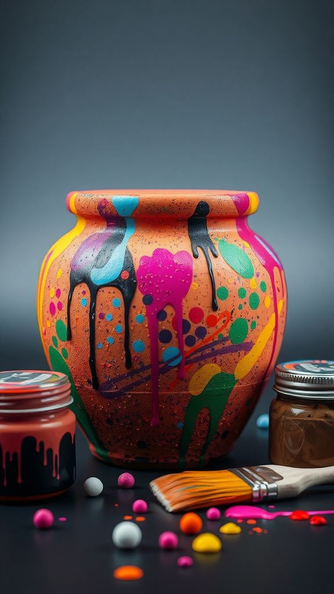
A livelier approach featured spontaneaous splatters and energetic marks that felt liberating and bold. The randomness of droplets and arcs lent a lively texture that contrasted with the pot’s predictable shape, and color collisions created fresh little surprises where drops overlapped.
The finish suggested an afternoon of freed-up hands and laughing, and the resulting chaos read as joyful rather than messy. Giving someone a pot like this felt like passing along a moment of unplanned delight, a small rebellion against overthinking.
Steps
- Prepare bold contrasting colors and protect surrounding areas before splattering to keep workspace tidy.
- Flick or tap a loaded brush to create dynamic drops and overlapping arcs across the pot’s surface.
- Build layers of splatter in complementary tones until the desired energy level is reached.
- Seal with a clear varnish to lock in the dynamic texture and color.
Blue and white coastal pattern with breezy charm
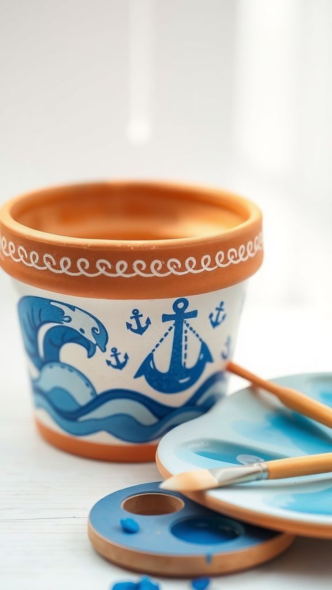
Classic blues and crisp whites wrapped a pot in a nautical whisper, reminiscent of sea glass and shoreline breezes. Delicate wave motifs, tiny anchors, or simple line patterns created a serene, coastal rhythm that felt calming.
The cool palette contrasted with the pot’s warm base, and thin line work had a breezy looseness as if made outdoors on a boardwalk table. Giving this pot hinted at shared summers and salt-scented evenings, a tiny coastal memory kept indoors to brighten dull winter days.
Steps
- Select a crisp white and a range of blue tones to create coastal motifs like waves and small anchors.
- Paint base color in blue and add fine white details or pattern lines using a small round brush.
- Layer subtle washes of diluted blue for depth where desired.
- Apply a protective clear coat appropriate for indoor or outdoor placement.
Tiny gardens painted inside rim for secret delight
A hidden band of miniature blooms tucked just under the rim felt like a private joke between maker and recipient. The small scene required leaning in to appreciate, which invited closeness and curiosity.
The interior garden was intimate—miniature stems, buds, and dabs of color that rewarded a second look. The subtle placement made the whole pot feel layered with thought, a little secret planted at eye level.
When noticed, those tiny details often prompted delighted surprise and a smile that lingered longer than a glance.
Steps
- Plan a narrow band beneath the rim and sketch tiny floral elements to create an intimate scene.
- Paint small stems, buds, and highlights with a fine brush to keep scale delicate.
- Soften edges and add tiny dots of contrasting color for visual pop.
- Protect with a clear topcoat to preserve the miniature detailing.