I’ve spent weekends turning dollar store finds into cozy corners, and Dollar Store Home Decor Projects have a special place in my routine. They stretch imagination more than money, and the results sneak into places that need a little personality.
These simple projects work well in kitchens, entryways, bathrooms and small living spaces where small touches make a big impression.
I often mix painted metal, natural twine and faux greenery for a lived-in feel that still looks thoughtful and calm.
Painted mason jar herb planters for windowsills

Clear mason jars get a quick makeover with chalk paint, twine collars, and handwritten labels to become herb planters that brighten a sunny kitchen sill. The glass brings a little shine, the chalk finish adds matte texture, and the twine introduces a tactile, earthy contrast. Leafy greens pop against soft whites, minty greens, or muted pastels. I like pruning the herbs each week, which keeps the display lively and useful. These planters pair well with white subway tile or warm wood counters, keeping a relaxed, homemade vibe.
Styling Tips
- Group three jars at different heights for visual interest.
- Mix real herbs with a couple of faux stems for low maintenance.
- Use small chalkboard labels for plant names and watering notes.
Turn dollar frames into a photo wall gallery
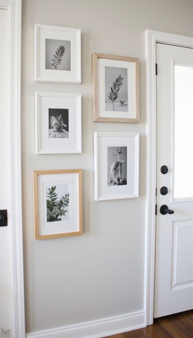
Inexpensive frames can be unified with a single spray-paint color or covered in textured washi tape to create a cohesive photo wall. Mixing textures—matte painted frames, a few metallic accents, and one or two distressed finishes—gives depth without chaos. Stick to a simple palette like black, white, and warm gold, or soft pastels for a gentle look. I often swap family photos for botanicals or fabric swatches depending on the season; switching images refreshes the wall without much effort.
Styling Tips
- Lay frames on the floor to arrange before hanging.
- Include two different frame sizes for rhythm and balance.
- Add a lone mirror to bounce light among photos.
Washi tape wall art — quick and changeable
Washi tape is an instant way to make geometric wall art or temporary murals without nails or heavy tools. Rolls in subtle patterns, metallics, and matte colors layer well across smooth painted walls. The texture is thin and paper-like, so shapes read crisp and modern; palettes of blush, gray, and cream keep the look calm while a touch of copper adds warmth. I like creating a framed-block grid above desks or beds because it’s easy to update—a small switch brightens a corner without commitment.
Styling Tips
- Use a level and light pencil marks to plan lines.
- Mix widths of tape for a layered, dimensional look.
- Peel gently to reposition until the pattern feels right.
Terra cotta pot updates with paint and ribbon

Small terra cotta pots from basic shelves transform with a couple coats of paint and a ribbon or painted stripe near the rim. The raw clay texture becomes a softened surface when paired with matte paint in sage, terracotta, or dove gray. A ribbon adds a tiny textile detail that reads cozy and intentional. These pots work great on bathroom shelves for succulents or as catchalls on bedside tables. I enjoy swapping the ribbon color to match seasonal linens, so the same pots feel fresh each time.
Styling Tips
- Seal painted pots with a water-based clear coat for durability.
- Group assorted sizes together for a layered display.
- Add small pebbles inside for drainage and a natural look.
Make a magnetic spice rack from tins
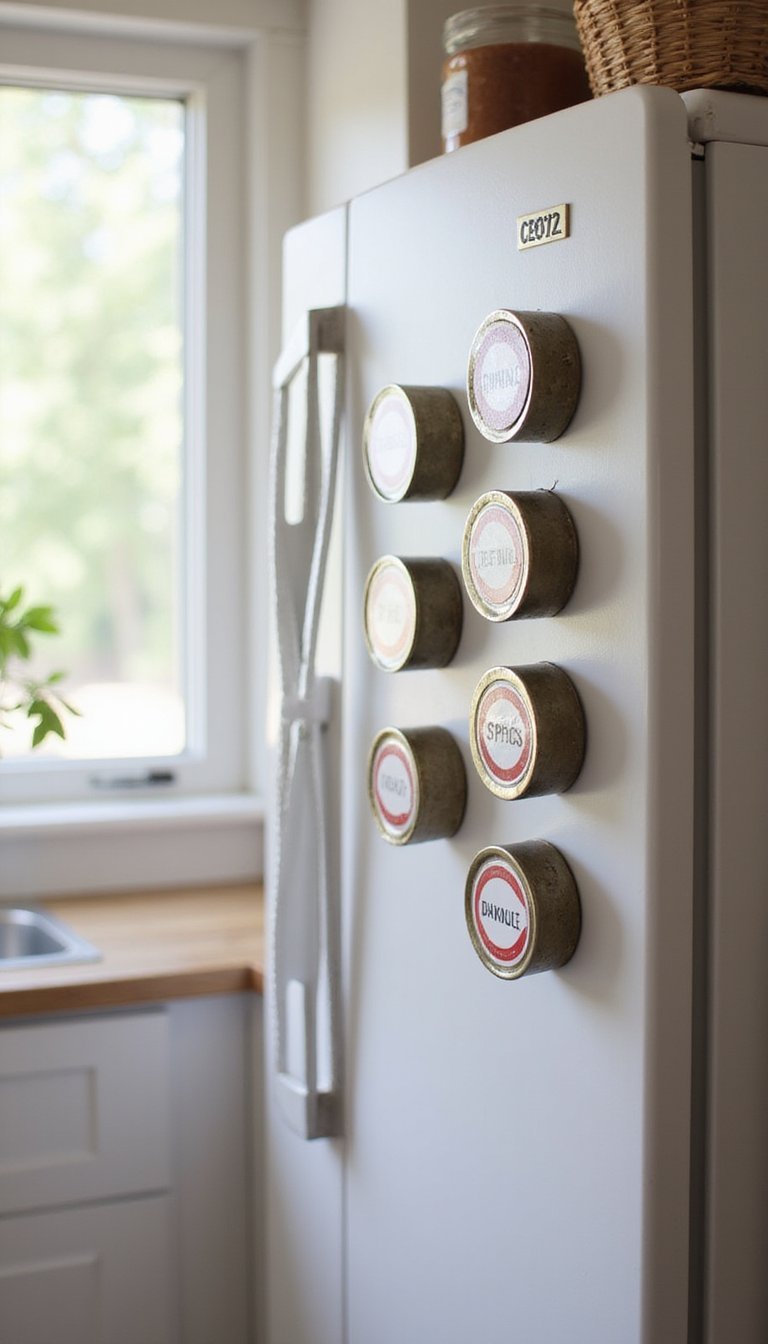
Small metal tins become a clean, floating spice rack when given magnetic lids and arranged on a painted metal strip or the side of a refrigerator. Painted labels, matte finishes, and clear windows balance the metal sheen with softer visual texture. Keep the palette neutral with pops of mustard or forest green for easy reading and a coherent look. I mounted a tiny strip near my stove; reaching for spices feels more joyful when the display is tidy and colorful in a quiet way.
Styling Tips
- Label tin lids with printed or handwritten tags for quick ID.
- Group similar spices together for intuitive use.
- Use removable magnetic strips for renter-friendly setup.
Framed fabric panels for instant texture
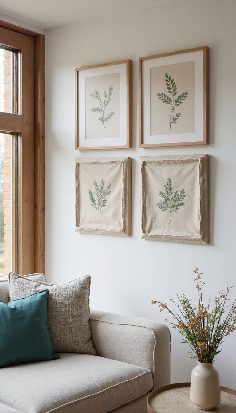
Stretching inexpensive fabric over basic frames creates instant wall panels that add pattern and softness. Linen blends, woven textures, or floral cottons bring tactile contrast to flat paint. Choose a palette such as warm neutrals with a single accent color—teal or rust works well—to tie the room together. I swapped out seasonal fabrics to change the mood without rehanging hardware. Panels like these work above a sofa or as a headboard alternative, offering a quieter, layered approach to decorating a primary wall.
Styling Tips
- Use foam board as a lightweight backing for easy hanging.
- Mix fabrics with different weaves for subtle contrast.
- Align patterns across multiple panels for continuity.
Makeover a plain mirror with wooden trim
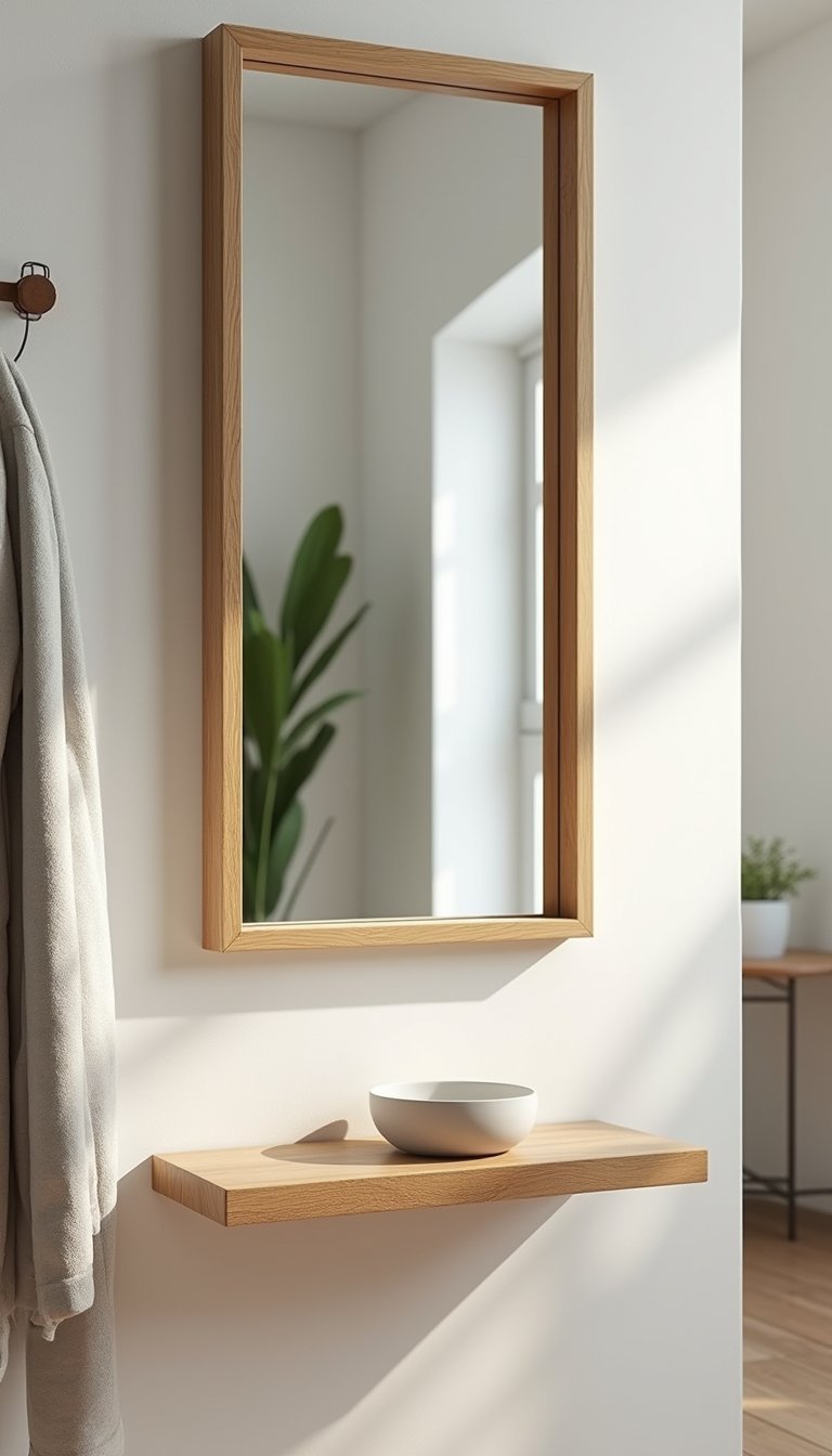
A basic mirror becomes a focal point when trimmed with narrow wooden slats or painted foam molding. The texture of wood or faux wood adds warmth and a tailored edge to the reflective surface. Choose a stain or paint color that complements nearby furniture—light oak or soft gray tends to integrate well. I once added rough-cut trim for a cottage feel; the result was a mirror that looked like it had been custom made. Mirrors like this ground entryways or bathrooms with a tidy, handcrafted look.
Styling Tips
- Use construction adhesive for a flush fit without heavy tools.
- Sand lightly for an aged, lived-in finish.
- Pair with a small shelf below for keys or toiletries.
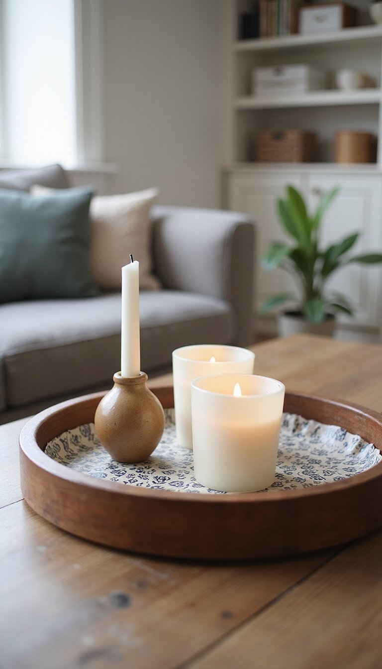
Glass votive cluster as a coffee table centerpiece

Groups of small glass votives and candle holders create a warm table center without needing expensive pieces. Mix frosted, clear, and lightly tinted glass for a layered look; the interplay of matte and shine is inviting. Arrange on a round tray or a wooden board to keep things intentional. I like pairing soft amber glass with cream textiles and a sprig of greenery nearby, which reads calm and curated. This setup fits living rooms and dining tables where small, changeable displays feel right.
Styling Tips
- Vary candle heights for a comfortable, staggered silhouette.
- Place on a heat-resistant tray to protect surfaces.
- Add a single sprig or clove of dried flowers for texture.
Woven placemats become a boho headboard

Round or rectangular woven placemats can be wired or glued together to form an interesting headboard panel. The natural straw and rattan textures introduce an organic element that pairs beautifully with linen bedding and soft white walls. A neutral palette—beige, tan, and cream—keeps the look calm while a painted frame can anchor it, depending on taste. I hung a set above a twin bed for a weekend guest room and found it instantly added character without a major purchase.
Styling Tips
- Secure with small picture hooks for easy removal.
- Mix sizes to create an irregular, handcrafted silhouette.
- Complement with woven throw pillows to echo the texture.
Upgrade throw pillows with dollar fabric
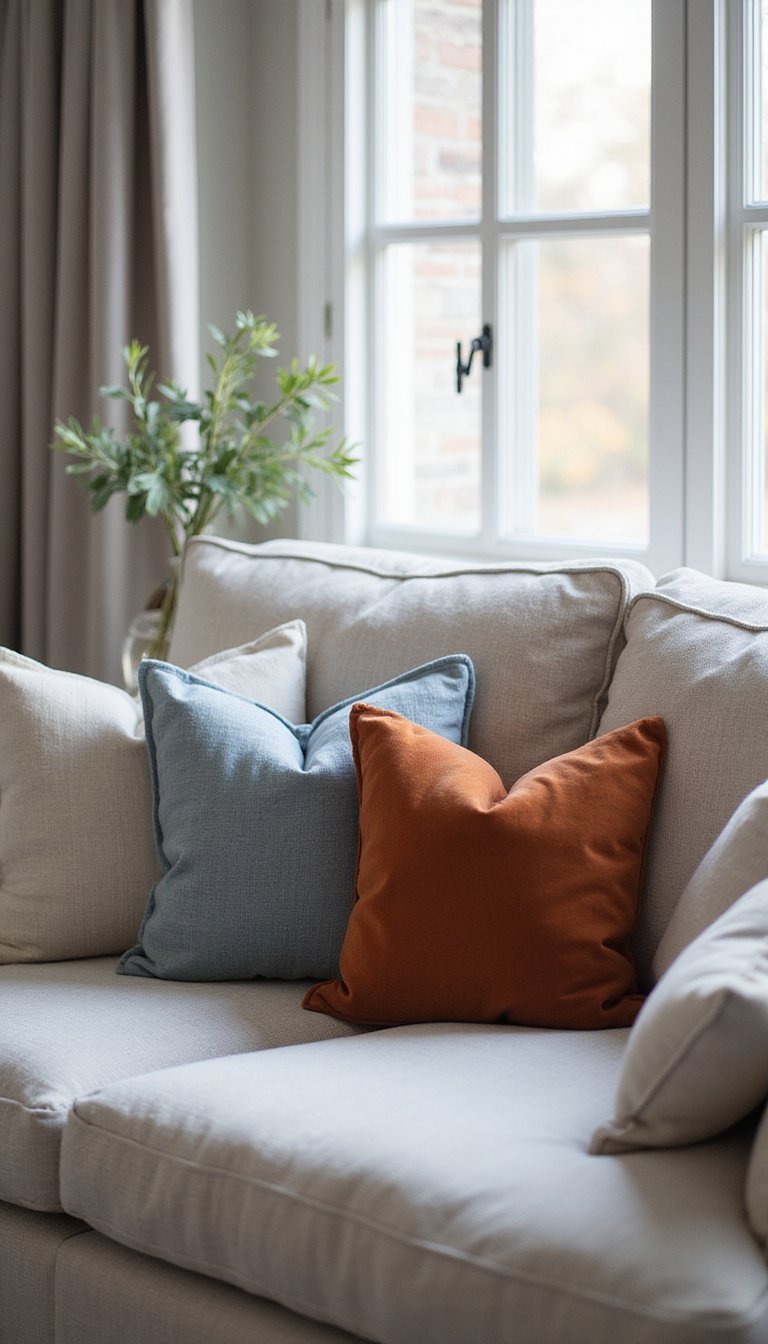
Basic throw pillows get new life when covered with remnant fabrics or printed napkins from everyday shelves. Cotton, linen blends, and velvety textures each change the mood: linen feels airy, velvet reads richer. Stick to two or three colors that echo a room’s palette—soft gray, warm rust, or dusty blue keeps cohesion. I often layer a patterned cover over a solid base pillow; the contrast adds dimension and makes the sofa feel tended to, like a favorite outfit left ready for the next afternoon.
Styling Tips
- Use inserts with extra loft for a plush look.
- Mix patterns and solids in a 2:1 ratio for balance.
- Rotate covers seasonally to refresh the room without new pillows.
Create a lacquered tray with contact paper
A plain wooden tray becomes striking when lined with patterned contact paper and a clear protective finish. The shiny contact paper adds color and pattern; a matte lacquer softens the reflection and seals edges. Choose patterns that echo existing accents—geometric black and white, muted florals, or soft marble—and keep the overall palette limited for cohesion. I like using trays for bedside corral or coffee table staging; once covered, they make rearranging small items feel intentional and tidy.
Styling Tips
- Trim contact paper edges carefully for a neat seam.
- Apply a few thin coats of clear sealer for longevity.
- Use the tray to group items of two or three for visual calm.
Upcycled baskets for sorted shelf storage
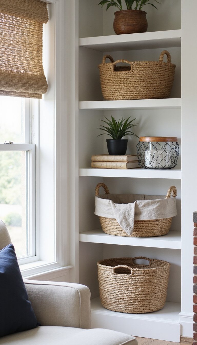
Wicker and wire baskets add texture to open shelving and hide small clutter while keeping a room feeling airy. Lining baskets with fabric or paper softens the interior look and protects items. Neutral fibers mixed with a single darker accent color—navy or charcoal—create contrast without overwhelming the shelf. I stash magazines, throw blankets, and kids’ toys inside these baskets; the mix of woven texture and soft textiles keeps the space approachable and intentionally layered, which I prefer over completely closed storage.
Styling Tips
- Use baskets of varying heights to create rhythm along a shelf.
- Label inside the basket with small tags for quick organization.
- Keep heavier items in sturdier wire baskets for support.
Simple pegboard command center for the entry

A painted pegboard becomes a tidy entry command center with hooks, small shelves, and simple bins attached. The board’s perforated texture is practical and visually graphic; using a soft paint shade like warm gray or sage makes it feel integrated instead of industrial. Add a small shelf for mail, a hook for keys, and a clip for quick notes. I mounted one near my door and found mornings felt calmer knowing where small items lived. The area looks curated even when in use because each element has a place.
Styling Tips
- Paint the pegboard the same color as the wall for a built-in look.
- Use baskets and hooks of mixed materials to add interest.
- Add a shallow shelf for sunglasses and small daily items.
String photo display with clips — casual gallery

String, twine, or thin rope paired with decorative clips creates an easy photo display that’s flexible and personal. The soft fiber adds a handmade texture against smooth plaster or paint, while photos, postcards, or small prints add warmth. Use a limited color palette for the clips—wood, brass, or black—to keep the display feeling orderly. I swap images for small postcards collected on trips, which keeps the wall feeling like a living story rather than static decor.
Styling Tips
- Hang strings in tiers for layered depth.
- Mix small art prints with snapshots for variety.
- Use matching clips for a calm, unified look.
Transform a plain lamp with patterned shade

A store-bought lamp base can look fresh with a custom shade covered in fabric, paper, or even painted patterns. The shade texture—woven linen, printed cotton, or a subtle metallic—changes the glow and overall mood. Stick to a color that complements existing accents: navy, warm rust, or pale blush for a gentle touch. I often replace shades seasonally; a new cover can shift a room’s balance without replacing the base. This approach keeps lighting adaptable and visually interesting.
Styling Tips
- Measure shade circumference before choosing material for a snug fit.
- Consider a double layer for printed fabrics to avoid light bleed.
- Coordinate shade color with a nearby pillow or rug for cohesion.
Seasonal wreaths from faux greenery bunches

Gather faux eucalyptus, berries, and little florals to create wreaths that transition through the year. The mix of matte leaves and tiny glossy berries creates an appealing texture contrast against a painted door or wall. Keep the colorway toned—greens, muted reds, and soft whites work well—to stay versatile across seasons. I enjoy swapping a wreath between holidays; it’s a small change that greets visitors with personality and gives the exterior or entry a steady, cared-for feeling without much fuss.
Styling Tips
- Secure stems with floral wire for a tidy back finish.
- Add a neutral ribbon loop for easy hanging and a soft detail.
- Combine different leaf shapes for a fuller silhouette.
Simple shelf liners as mini art displays

Decorative shelf liners with marble, terrazzo, or floral motifs become miniature art when framed or used as backing on open shelves. The printed texture adds a subtle backdrop that elevates everyday objects like mugs and vases. Choosing liners in soft neutrals or a single accent hue helps keep a sense of calm. I sometimes swap liners behind kitchen open shelving to change the rhythm of dishes and glassware, and the small pattern shift surprises me more than expected in how it refreshes the space.
Styling Tips
- Cut liners to size with a sharp blade for neat edges.
- Use removable adhesive for renter-friendly changes.
- Match liner color with small ceramics to tie the shelf together.
Refinish a small side table with chalk paint
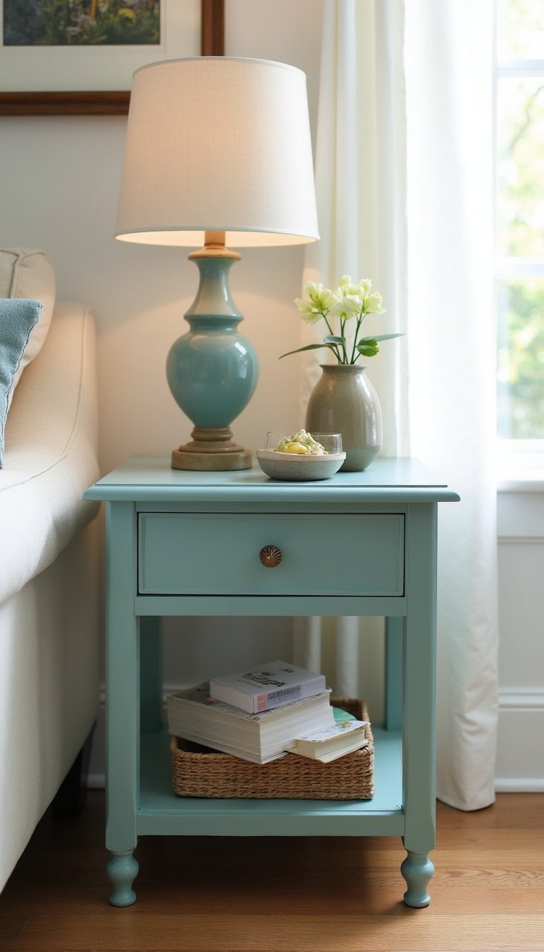
A modest side table becomes a fresh anchor piece after a few coats of chalk-style paint and gentle sanding along edges for a soft, lived-in look. The paint’s matte surface contrasts nicely with a metal lamp or glossy ceramic vase, while an accent color—stone gray, muted teal, or pale cream—ties to nearby textiles. I often pair a painted table with a woven basket underneath to add both function and texture, and the result feels personal, like a secondhand find given a new story.
Styling Tips
- Sand between coats for a velvety finish and good adhesion.
- Distress gently at corners for a comfortable, worn feel.
- Top with a small tray to protect the surface from cups.
Create a tray for jewelry with felt and frame

A shallow frame lined with cut felt becomes a soft tray for jewelry or keys. The felt’s nap creates a gentle texture that protects metals and stones, while the frame adds a tidy edge. Choose felt colors that echo brass tones or silver to keep the display harmonious—midnight blue, olive, or warm gray are nice options. I set one on my dresser to catch the small things I take off each night; having a dedicated spot makes the routine feel quieter and more orderly.
Styling Tips
- Glue felt smoothly to avoid lumps and air pockets.
- Use a shallow frame for small items to keep them visible.
- Add a tiny dish for rings to keep things separated.
Monochrome canisters for pantry uniformity

Matching canisters made from purchased containers become cohesive when painted or labeled the same way. Matte white or charcoal finishes paired with simple black labels create a calm, organized pantry aesthetic. The smooth surface of the canisters contrasts with rough paper labels or wooden scoops, offering a mix of textures. I swap contents seasonally—oats to rice to baking goods—and the unified look prevents a shelf from feeling cluttered even when full of everyday items.
Styling Tips
- Use airtight lids for dry goods to keep freshness.
- Label with a consistent font for a tidy look.
- Arrange by height for a clean shelf silhouette.
Napkin ring bouquet for the dining table
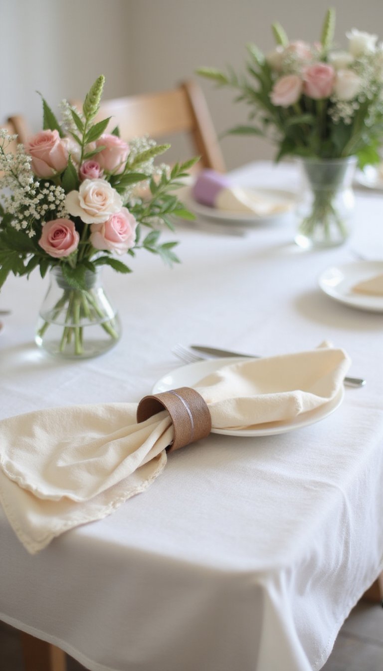
Small napkin rings paired with a cluster of faux or fresh stems become a mini bouquet centerpiece for casual dinners. The ring’s small scale keeps the arrangement low and intimate, while mixed textures—silky napkins, matte ceramic ring, and glossy stems—play together nicely. Choose napkin colors that harmonize with table linens, perhaps a warm off-white with a single accent color in the stems. I often line a row of these along a long table for a collected, unforced table setting that invites conversation.
Styling Tips
- Keep bouquets low so sightlines stay open across the table.
- Mix a few faux stems with fresh sprigs for longevity.
- Coordinate napkin fabric with chair cushions for a cohesive feel.